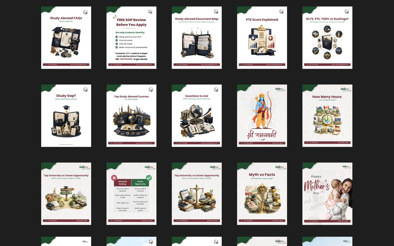
Fourteen months of one company's voice
Fourteen months designing the static content for SOPdrafts Nepal, an SOP and visa services business in Kathmandu. More than 160 posts, every one a carousel rather than a single frame, plus the festival greetings a Nepali audience expects a company to show up for.
- Brand content design, Carousel design, Visual consistency
- 2025/26
- Delivered
- Canva · Figma · AI-generated imagery
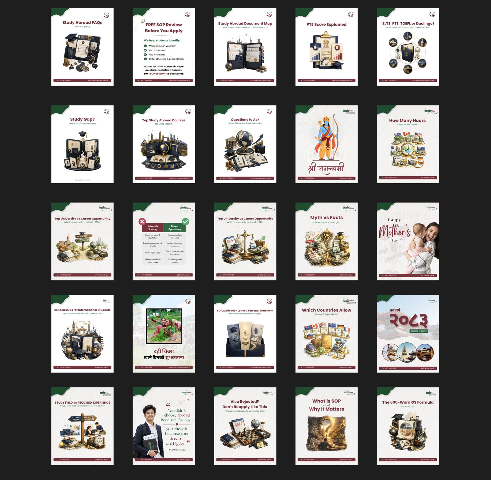
The job was consistency, not posts
Anyone can make one good post. The reason this ran for fourteen months is that a services business selling something as consequential as a visa application is judged on whether it looks like it has its act together, and a feed that changes character every fortnight says the opposite.
So the work was mostly restraint. One corner fold, one maroon for headlines, one contact bar along the bottom, applied post after post until the account was recognisable before anyone read the logo. The grid above is only the opening frame of each carousel; behind every one of them sit four to eight more.
Why every post is a carousel
A single frame can hold a greeting. It can't hold the difference between an SOP, a motivation letter and a personal statement, and that difference is the thing a student is actually confused about.
So the format is a cover that earns the tap and then the substance behind it: the document map, the test comparison, the reasons a visa gets refused a second time. The cover has to earn the tap and the inside has to be worth it, which is roughly how the business works offline too.
Canva first, then Figma, then AI
Canva carried most of it, because a template the client can open and adjust after handover is worth more than a file only I can maintain. Figma for anything that had to be exact or reused across the set.
Generated imagery for the illustrations, which is what makes this workable at volume: a study-abroad document map or a scholarship illustration has no usable stock equivalent, and commissioning each one was never going to fit the budget. What was never generated is the decision about what a post is for, or the claims inside it. This is a business where a wrong detail costs a student an application.