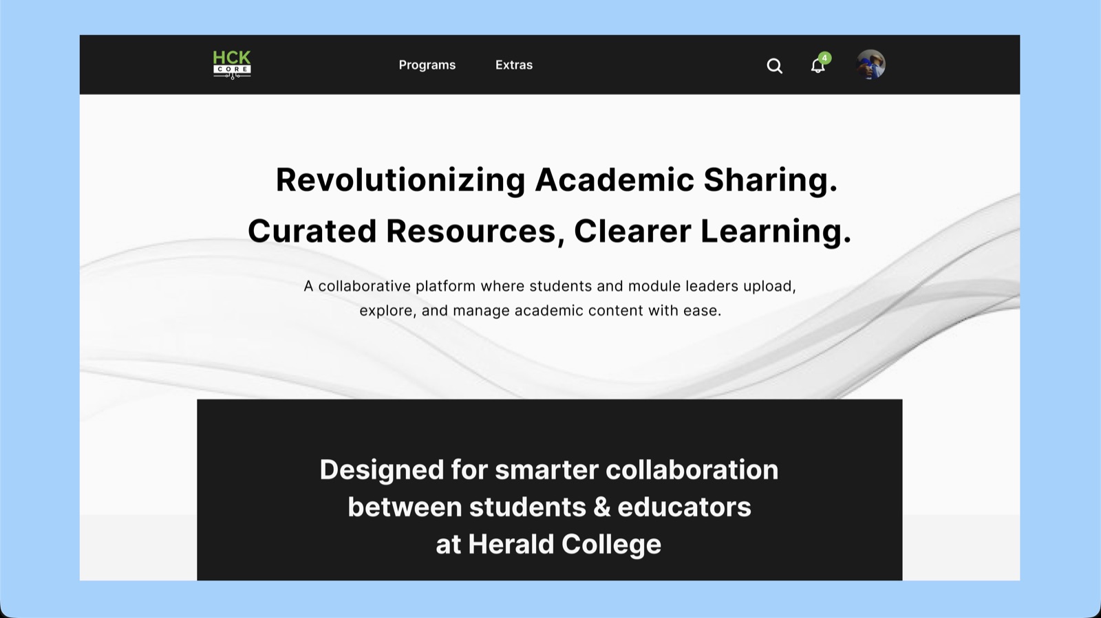
Designing a college's resource platform
HCK Core is a resource-sharing platform with separate student and moderator portals, covering academic modules, extra learning resources and community features. I was the only person doing UI/UX on it. The college's development team later built it, with modifications, and published it.
- Sole UI/UX designer, Flows, Interface design
- 2025
- Delivered
- Figma · Adobe XD
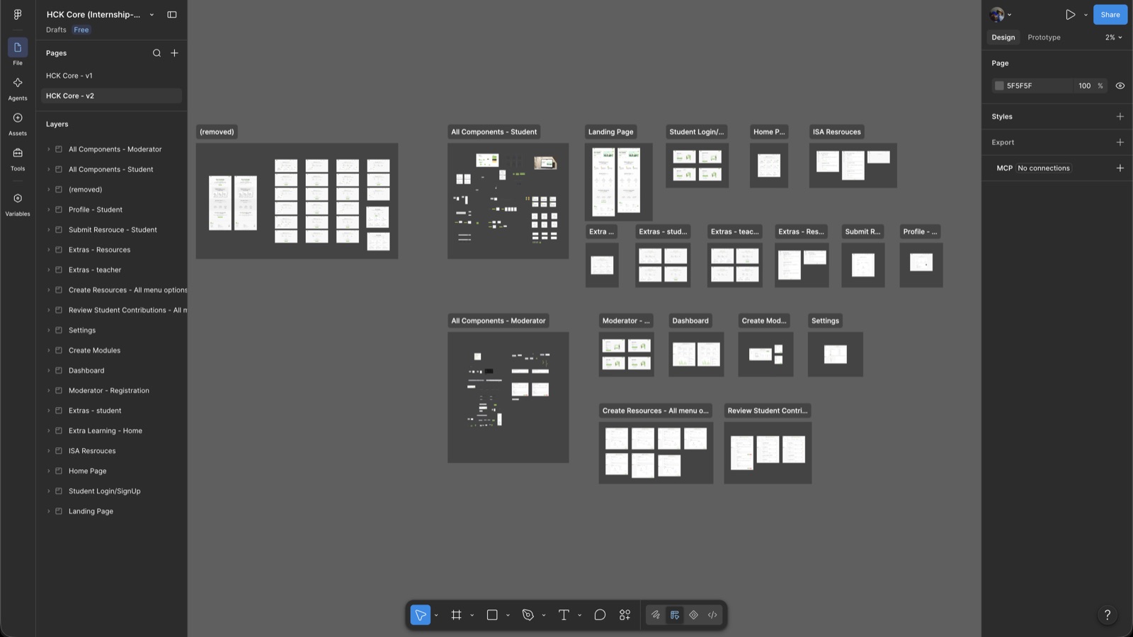
Two portals, one system
Students and teachers want opposite things from the same content. A student wants to find one specific resource for tomorrow's class as fast as possible. A teacher wants to see everything they've put into a module and whether it's complete.
The temptation is to build two products. What I designed was one system with two entry points: the same modules, the same resources, arranged around a different question.
The first time it was someone else's brief
By the time this started I had been teaching myself UI in Figma every day for a long time, building interfaces nobody asked for, redrawing apps I used, posting the results. Most of that work only ever lived on LinkedIn and TikTok.
This was the first time it was a job with someone else's requirements attached, and a deadline that wasn't mine to move.
What being the only designer taught me
Nobody was going to catch my mistakes. There was no second designer to say a flow didn't make sense, so I had to build the habit of arguing with my own work, walking a screen as a student who was late and stressed, then again as a teacher uploading at midnight.
It's the reason I now design flows before screens. A pretty screen in the wrong place in a flow is just a nicer way to be lost.